which means towards using it to improve.
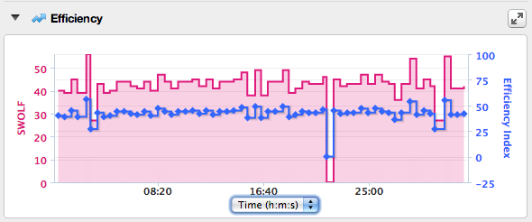
This graph above is from this workout below:

And these definitions:
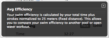
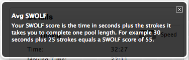
Are what pop up when you click on those little question marks next to the relevant term in Garmin Connect. So. Yeah. Doesn’t help much right? I will say that it explains why these numbers are always the same for me (because Avg Efficiency is the Avg SWOLF normalized to a 25m pool . . . and I do all my workouts in a 25m pool).
Good first step. Now I’ll have to do some research and figure out ways to use these numbers to try and get better. Or something like that.
Dude, your are killing it in the pool. I am slow as molasses.